None
EN
From Metrics to Mood: The Emotional Story in A HYROX Race
['Andrew Peters', 'Soha Elghany', 'Silvia Romanelli', 'Root', '--M-A-Box-Bp', '--M-A-Box-Bp-L', '.M-A-Box', 'Width', 'Margin-Top', 'Important Margin-Bottom']
| Nightingale | Nightingale
In the world of sports performance, data is everywhere.
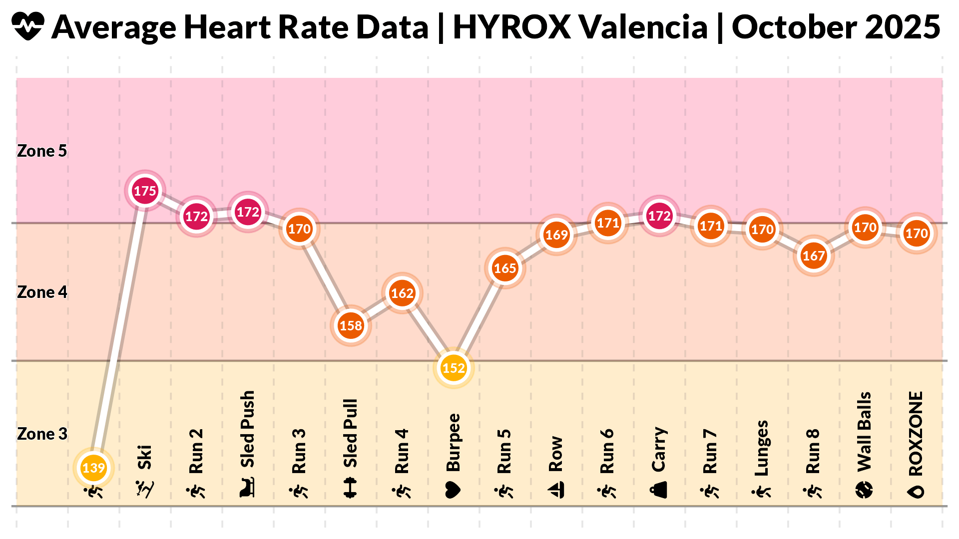
This HYROX chart condensed over an hour of physical effort into a few compact panels.
That’s when I realised how much emotional weight colour can carry in performance visualisation.
From metrics to meaningsWhat I learned from visualising my HYROX race wasn’t just where I was fast or slow, but how visualisation framed that story.
For data visualisation practitioners, that’s a valuable reminder: the goal isn’t only to display information, but to mediate understanding.